
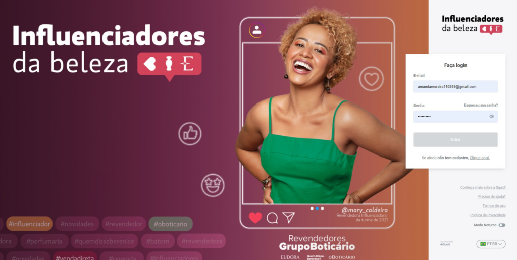
Influencer Marketing Platform
#1 Design Ops
As the product ecosystem scaled, design became a critical function, but the team lacked visibility, clear processes, and defined responsibilities across squads. Designers were often involved inconsistently in discovery, and the absence of a structured workflow made it difficult to align expectations, define deliverables, and ensure predictable timelines.
This scenario created friction between design, product, and engineering, impacting both delivery quality and team efficiency. Establishing a Design Ops foundation became essential to bring clarity, consistency, and scalability to the design practice.
Design Workflows
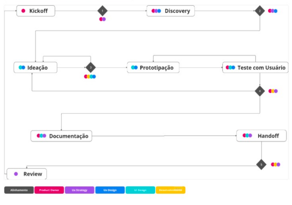
To address the lack of clarity and consistency in the design workflow, I led the definition of a structured methodology that connected discovery, design, and delivery into a single, traceable flow.
Rather than introducing a rigid process, the goal was to create a shared understanding across squads. It became clear when design should be involved, what each phase required, and what “ready” meant at every step.
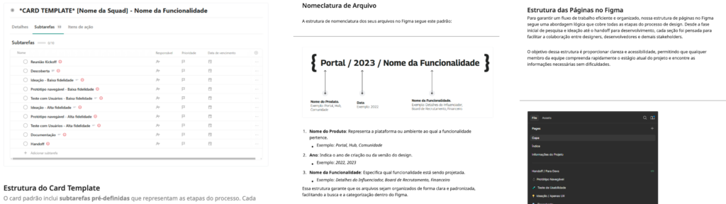
This resulted in a clear end-to-end workflow, moving from kickoff and discovery through ideation, prototyping, validation, documentation, and handoff. Responsibilities were defined across Product, UX, UI, and Engineering, while standardized cards and file structures helped guide execution and maintain consistency across projects.
Design Culture
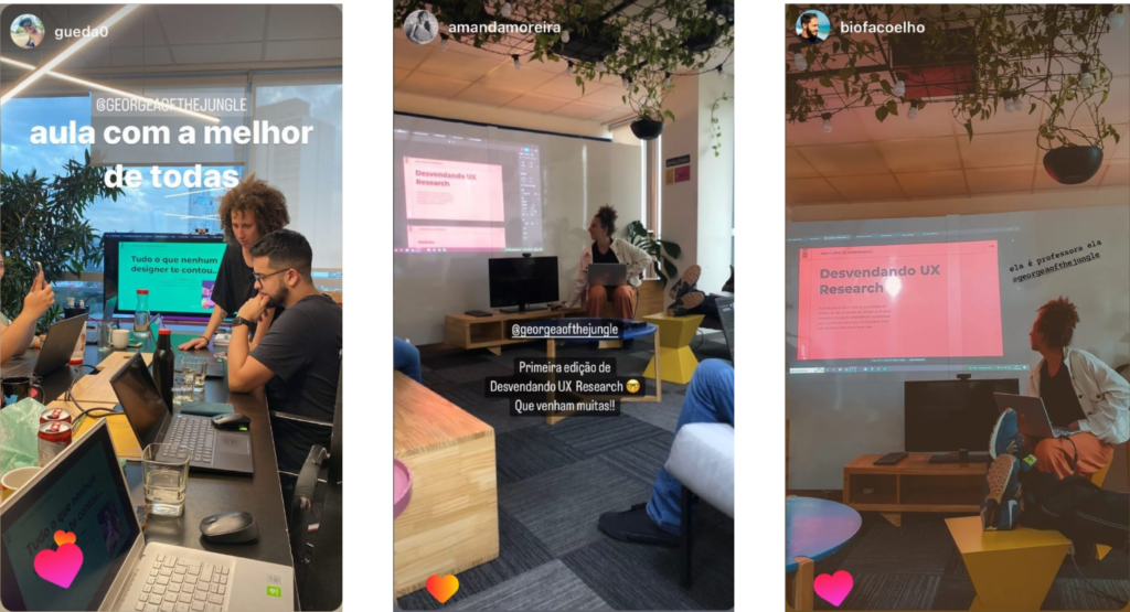
At the same time, design visibility was strengthened through internal workshops, presentations, and hands-on sessions. These moments helped teams better understand design decisions and increased trust in the process. As a result, designers became more integrated into sprint cycles, with clearer deliverables, less ambiguity, and more predictable timelines.
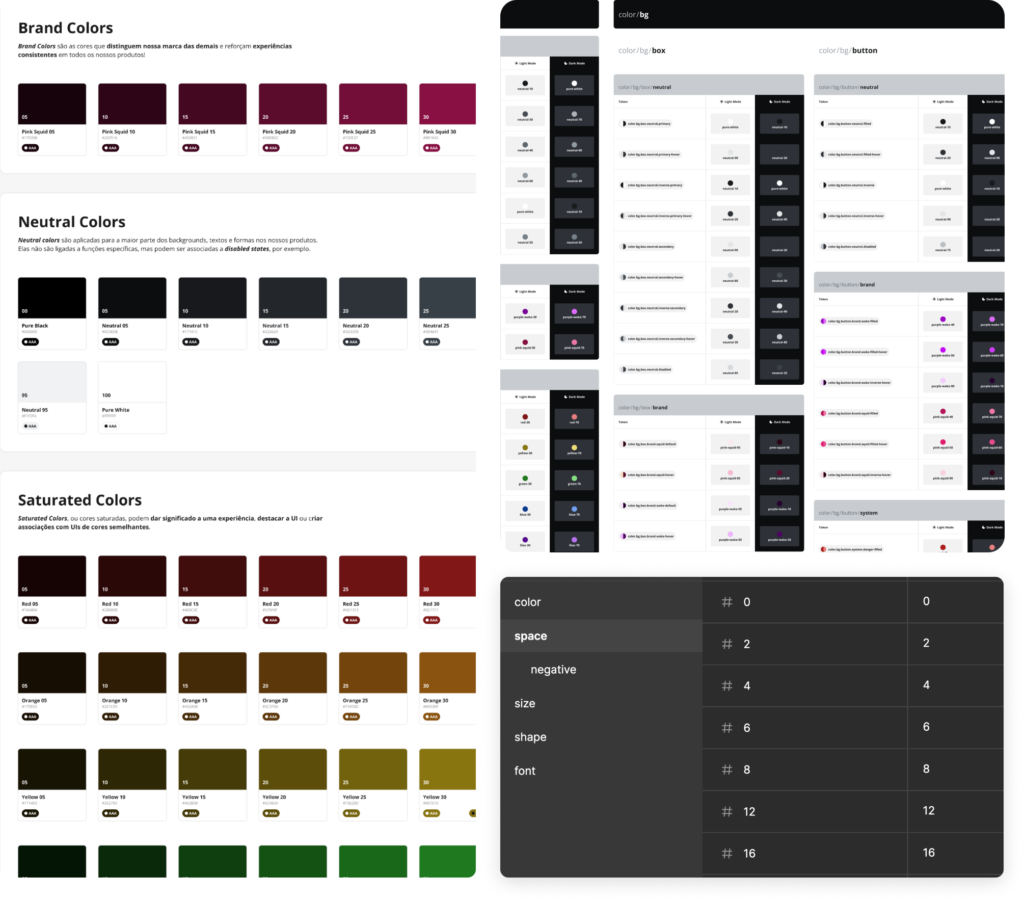
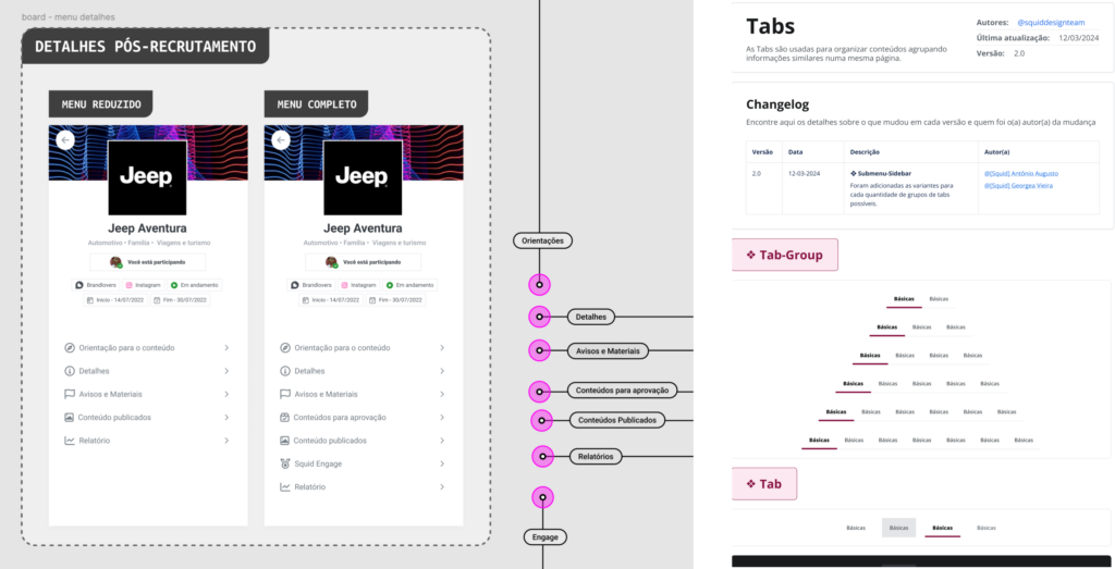
Design System
The design system was created to bring consistency and scalability to a product evolving across multiple contexts, including white-label solutions.
A structured style guide was defined early on, covering color, typography, spacing, and dark mode, establishing a consistent visual foundation across squads.
I led the evolution of the color system, defining guidelines, expanding the palette, and ensuring accessibility and consistency. My role focused on direction and alignment, guiding the team toward a scalable solution rather than hands-on execution.
The system evolved into reusable components and design tokens, enabling flexibility while maintaining coherence. All elements were documented in Figma, improving collaboration with engineering and supporting long-term scalability.
# 2 Operations Product
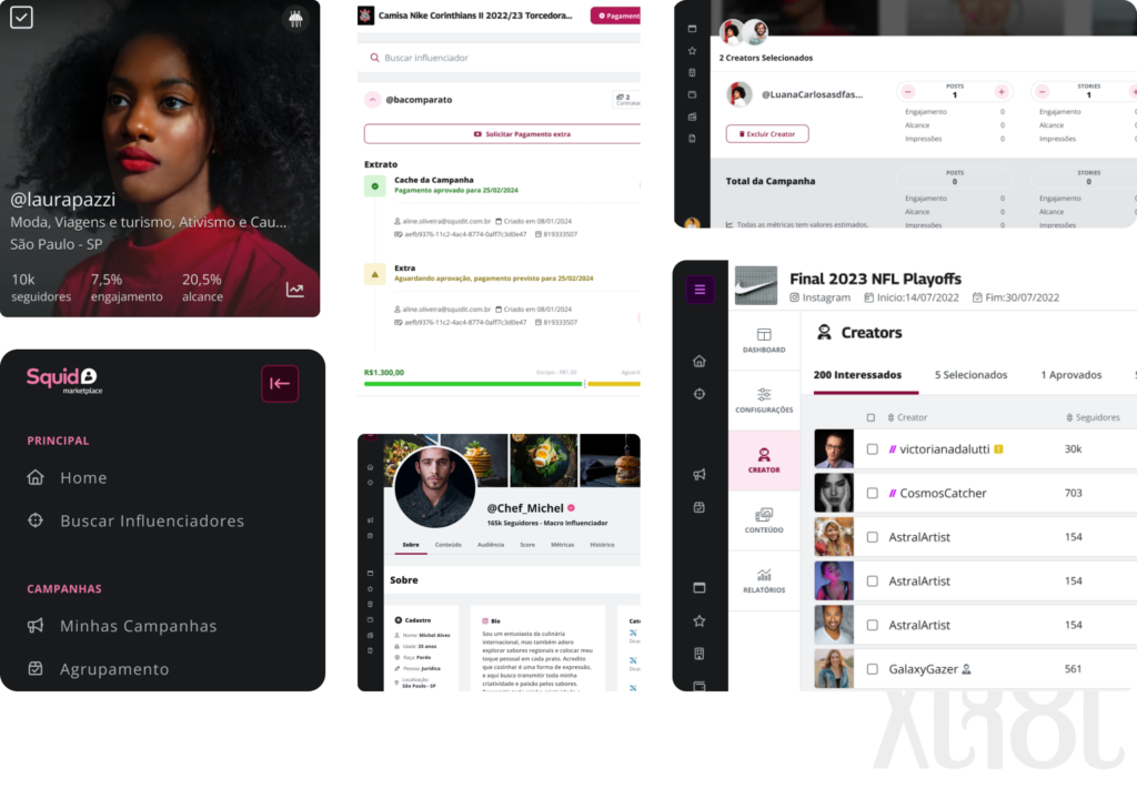
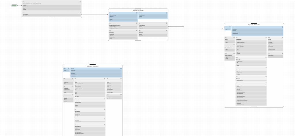
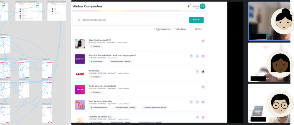
The administrative platform was the operational core of the product, where brands and internal teams managed the full lifecycle of influencer campaigns. From planning and creator selection to content approval, payments, and performance tracking, the system supported complex workflows that required clarity, speed, and reliability.
Beyond campaign management, the platform needed to handle a wide range of scenarios, including different campaign types, approval flows, and large volumes of data. This created constant challenges around usability, information hierarchy, and decision-making under pressure. My role also involved connecting product, engineering, and business needs, ensuring that solutions were not only user-centered but also operationally viable. See the screens
Campaign creation
Campaign creation was the operational core of the platform, involving multiple stakeholders such as agencies, internal teams, and global brands, each with different goals and levels of expertise.
As a SaaS product, it required a high level of customization, supporting different campaign types, approval flows, and business rules. This complexity directly impacted usability and demanded a careful balance between flexibility and clarity.
Because this setup defined the entire downstream experience, from influencer recruitment to content approval and reporting, any friction would scale across the workflow.
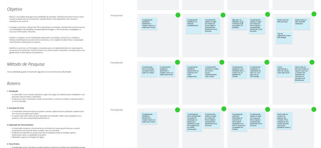
To address this, we conducted deep discovery through team immersion, workshops, and structured research, focusing on uncovering real operational pain points and grounding decisions in actual user needs.
Low-fidelity usability testing
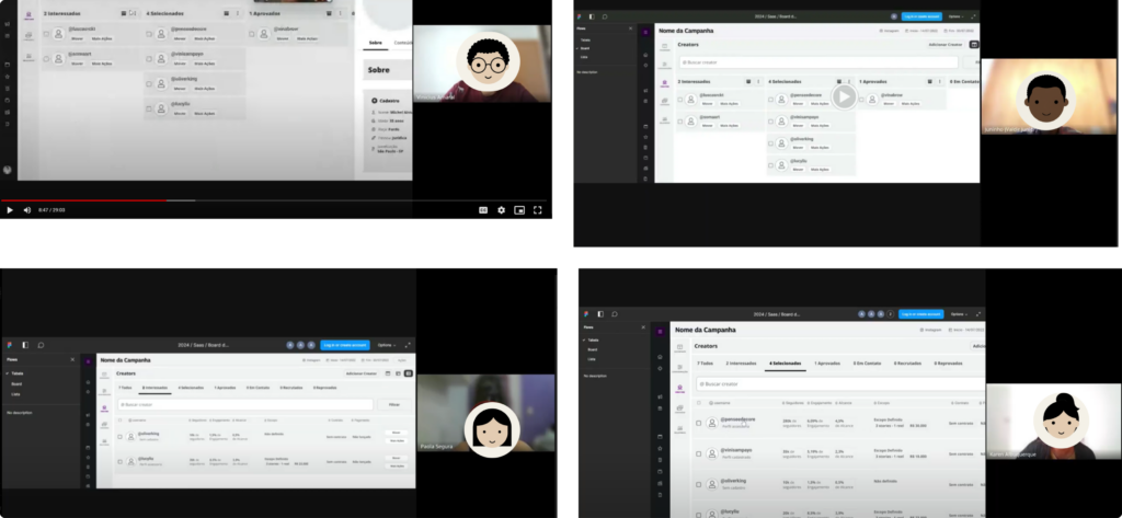
Low-fidelity usability testing played a key role in shaping the solution. Through multiple iterations of prototypes, we were able to quickly validate ideas, identify friction points, and refine flows before development.
This was a continuous cycle of designing, testing, learning, and iterating. Each round of feedback brought new insights, allowing us to progressively simplify complex interactions and improve clarity for different user profiles.
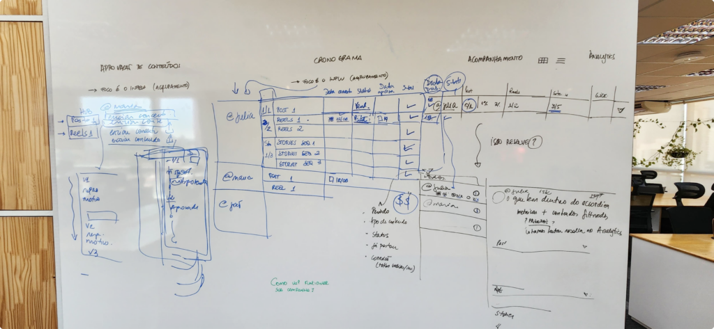
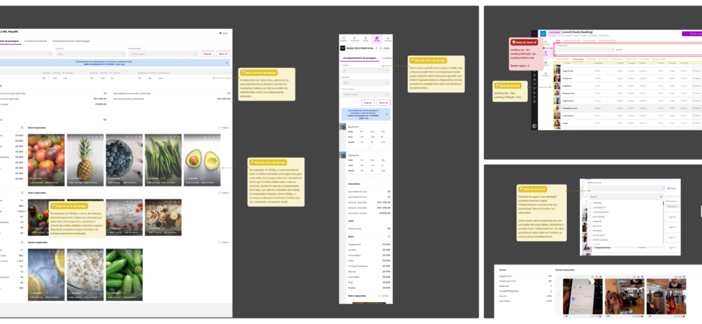
Planning & documentation
Planning and documentation were critical to aligning teams and ensuring consistency throughout the process. Insights gathered during discovery and testing were translated into clear artifacts, supporting decision-making and guiding the product team during development.
This structured approach reduced ambiguity, improved communication between teams, and ensured that design intentions were preserved across the entire workflow.
Handoff & Implementation Review
The handoff phase was essential to ensure that the designed solutions were accurately implemented. Close collaboration with front-end developers allowed for continuous validation, adjustments, and refinement during implementation.
Design did not end at delivery. The team remained actively involved after implementation, reviewing interfaces, ensuring consistency, and making iterative improvements to guarantee quality and alignment with the original design intent.
Continuous Improvement
Continuous improvement was driven by an ongoing discovery practice embedded in the product routine, rather than isolated research efforts.
We worked closely with the CS team, who were directly operating campaigns at scale, to understand real constraints such as high campaign volume, tight deadlines, and constant context switching. This environment exposed critical usability issues, especially around information hierarchy, filtering, and decision-making under pressure.
Through contextual inquiry, user interviews, and structured analysis of support conversations, we mapped recurring friction points and identified patterns in how users navigated and managed campaigns. These insights were continuously validated against quantitative signals, helping prioritize improvements based on real impact.
This approach allowed us to move from assumption-based decisions to evidence-based design, iterating on flows and interfaces with a clear understanding of user behavior, operational needs, and scalability constraints.
Business Impact
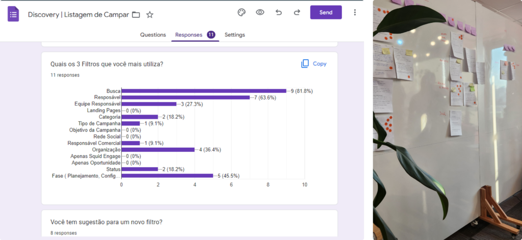
The influencer search was a core tool for campaign planning and decision-making. Its evolution focused on improving speed, clarity, and usability in complex, high-volume scenarios.
The interface shifted to prioritize visual recognition, highlighting influencer imagery to support faster evaluation. The filtering system was redesigned through user research to reduce cognitive load and enable more precise queries.
A campaign calculator was introduced within the search flow, allowing users to estimate scope, content volume, and investment, turning the experience into a decision-support tool.
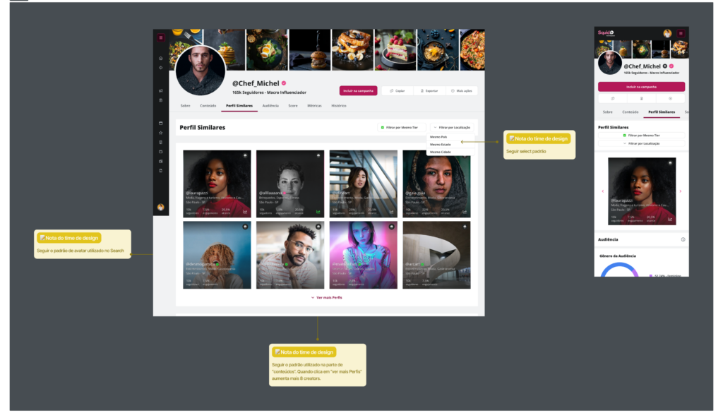
At the influencer level, complex data such as reach, engagement, and audience insights were structured with clear hierarchy and context, making them understandable even for non-specialists.
This continuous evolution strengthened the platform’s ability to support faster, more confident decisions, increasing its value for both users and the business.
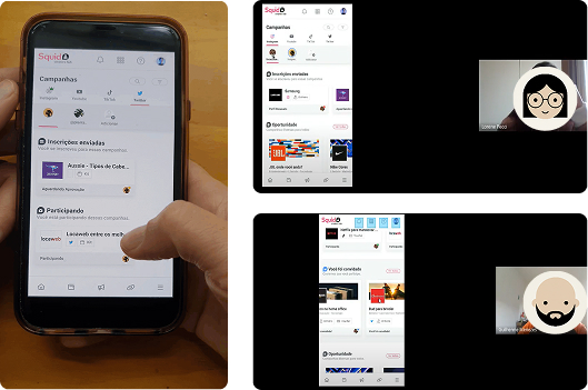
#3 Creators Hub
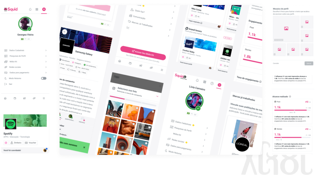
Is a mobile-first platform, available as a mobile app and a responsive desktop version, designed for influencers to manage the full lifecycle of their collaborations with brands. Through the platform, creators can discover and apply to campaigns, access briefs, track deadlines, submit and approve content, follow performance reports, manage payments, and receive insights to improve their posts and visibility to brands.
One of the core challenges of the product is supporting a highly diverse user base, ranging from nano and micro influencers to large creators and agencies, each with different levels of experience and needs. The platform also handles complex scenarios such as multiple social networks, campaign eligibility rules, different influencer tiers, and multiple profiles per user, requiring a carefully structured information architecture and scalable UX patterns. Building trust and transparency throughout the experience is essential to enable reliable data, meaningful insights, and long-term engagement between creators and brands. View the interface
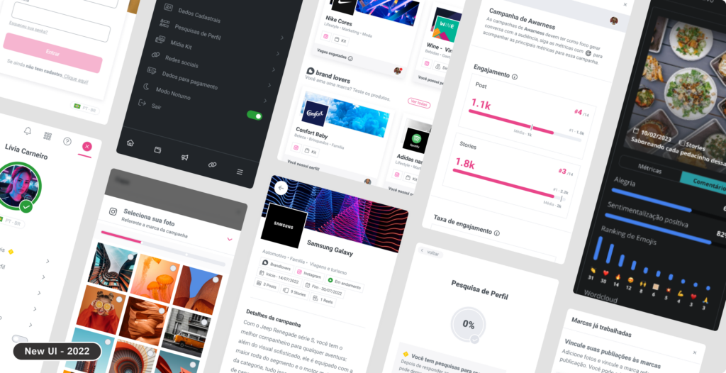
New UI
As the platform evolved, visual fatigue and readability became key issues, as the interface relied heavily on brand colors, making long usage sessions tiring and less accessible. The new UI introduced improved contrast and dark mode, reducing eye strain and improving accessibility. Another challenge was the campaign acceptance flow, where critical information such as contracts, requirements, and deadlines lacked clear hierarchy, leading to confusion and errors.
The redesign reorganized information and clarified primary actions, making the flow easier to understand and complete. In addition, the absence of consistent UI patterns affected usability and scalability. Establishing clear standards and reusable components made the experience more predictable and easier to scale. In a market full of generic interfaces, the new visual language also helped communicate maturity and trust, differentiating the platform and resulting in fewer errors and reduced support needs.
Behavior analysis
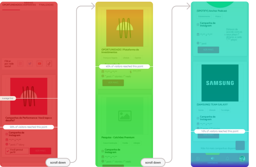
Behavior analysis using tools such as Microsoft Clarity and Smartlook revealed a critical drop in engagement on the campaign listing screen. Heatmap data showed that only 16% of users scrolled to the last campaign, indicating low content visibility and friction in vertical navigation. This insight highlighted that the existing layout did not support efficient exploration, especially given the volume and diversity of campaigns.
Based on this data, the layout was redesigned into horizontal content blocks with lateral scrolling, allowing campaigns to be grouped by category and reducing vertical fatigue. This structural change improved content discoverability, supported faster scanning, and enabled users to navigate between campaigns more intuitively, aligning the interface with observed user behavior rather than assumptions.
Usability Testing
During the discovery phase, part of the product team supported predefined hypotheses about organizing campaigns by multiple profiles and social networks. However, quantitative analysis revealed that only 8% of the user base had multiple profiles, highlighting the risk of relying solely on internal assumptions.
To validate the best approach, I led a usability testing process with three different hypotheses. We developed interactive prototypes and a structured research plan, conducting both online and in-person tests with real influencers and stakeholders. By combining qualitative findings with quantitative data, we identified the most intuitive solution, challenging initial assumptions and enabling a data-informed decision.
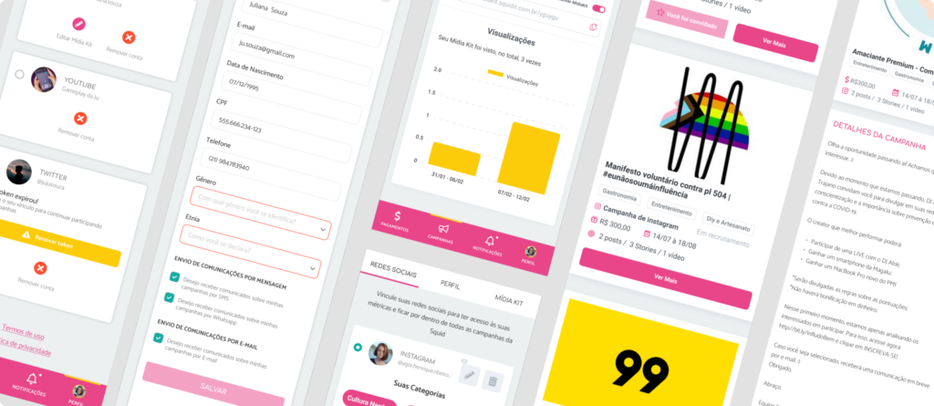
Token facebook
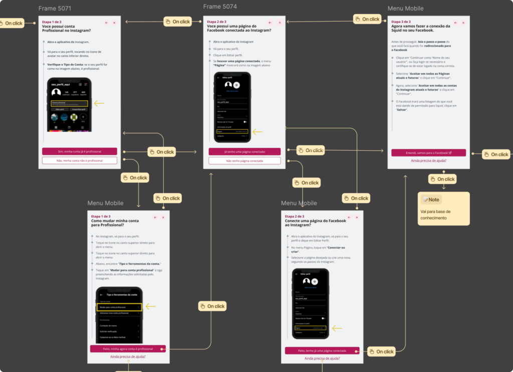
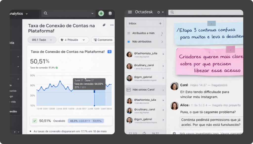
User trust was directly tied to our key metric: active token users, which represented influencers connecting their Instagram accounts to the platform and ensured reliable data for brands. To support this, the onboarding flow was continuously refined to reduce friction and reinforce trust.
This metric was tracked through A/B onboarding tests, analysis of influencer conversations with the CX team, monitoring in GA4, behavioral insights from Clarity, and moderated sessions observing real users completing signup and account linking. As a recurring quarterly OKR, we consistently achieved an average 66% account connection rate.
White Label
One of the platform’s key challenges was operating both as a scalable campaign product and as a fully customizable whitelabel solution. Beyond Squid’s standard experience, major brands could adopt an exclusive version of the tool with their own visual identity — including colors, logos, icons, and tone of voice — allowing the platform to feel like a natural extension of brands such as O Boticário, Samsung, L’Oréal, Spotify, Natura, Nike, Itaú, Cielo, P&G, Netshoes, and Shell.
From a UX perspective, the challenge was to balance flexibility and consistency, enabling deep visual customization without compromising usability, accessibility, or interaction patterns. This required a strong design system foundation and thoughtful interface architecture, ensuring an intuitive and reliable experience for influencers and marketing teams, regardless of the brand applied to the product, while keeping the platform scalable and sustainable over time.
Hand off
An effective handoff was critical to delivering the redesign within a tight timeline and with a lean team. Close collaboration with the lead front-end developer through weekly check-ins enabled faster decision-making, reduced rework, and improved delivery predictability. Well-documented files, clear flows, and properly specified components allowed the team to move quickly without compromising quality.
Consistent componentization, with attention to states, variants, and behaviors, streamlined implementation and supported scalability. In this context, a front-end background informed more pragmatic and technically feasible design decisions, strengthening the bridge between design and engineering and ensuring a faithful execution of the redesign despite time and resource constraints.
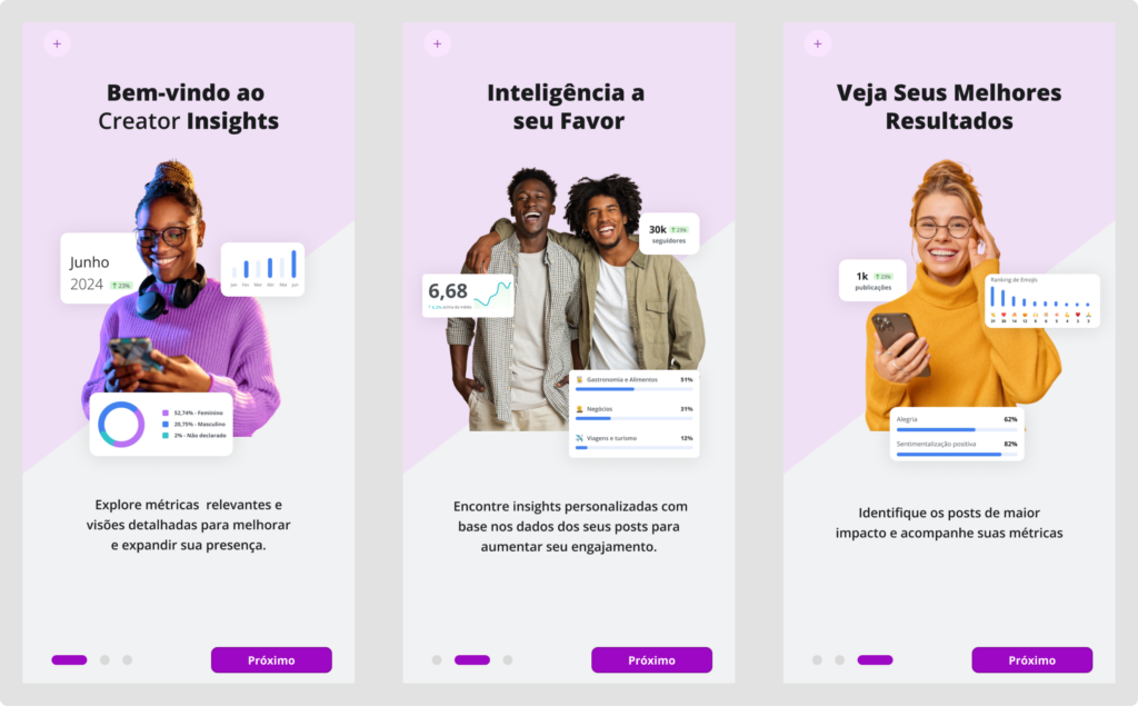
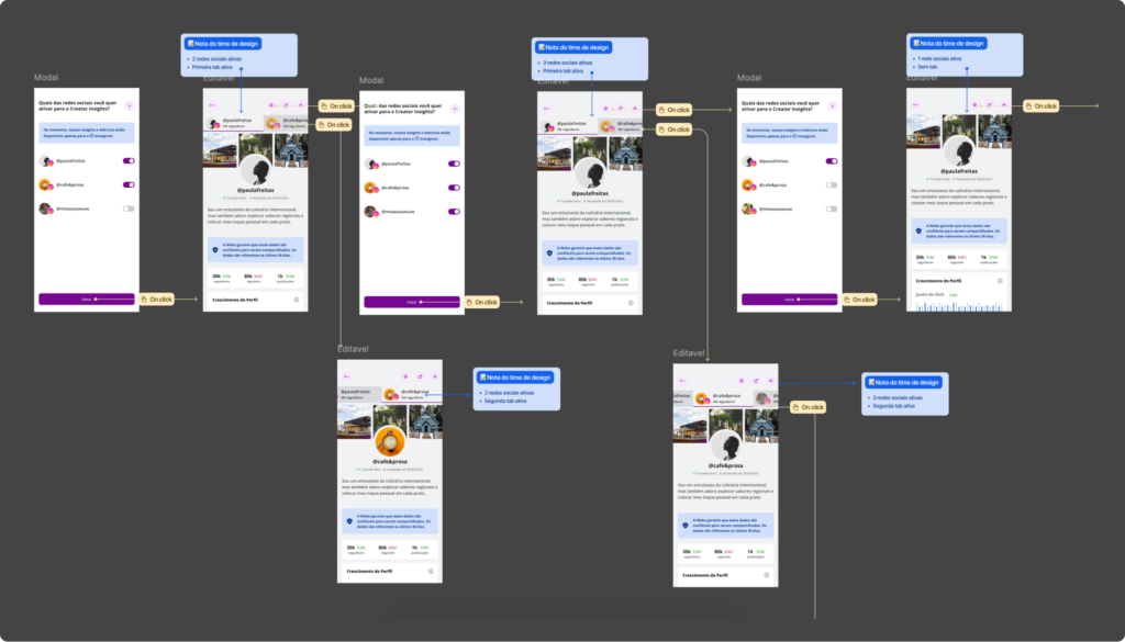
Creator Insights
Creator Insights was designed as a strategic pillar to deliver value before conversion, using data and education as levers to increase account connection and user trust. By surfacing relevant metrics, personalized insights, and high-impact content, the feature helped influencers understand the value of their data and the platform’s role in their growth.
The project started in the discovery phase, with market research across data-driven products — including athlete analytics apps, profile insight tools, and competitor platforms — enabling the team to identify engagement patterns, data visualization models, and activation strategies. Based on these insights, flows were designed for different user maturity states, such as no token, incomplete onboarding, active or inactive tokens, and incomplete cost-per-content data, ensuring clear progression and reduced friction throughout the journey.
To support strategic decision-making, prototypes were used as an alignment tool across product teams, stakeholders, and leadership, helping visualize potential paths and their business impact. The interface was designed from the ground up to support multiple social networks, accounting for their specific constraints while maintaining consistency, scalability, and clarity.