Restaurant Platform
#1 Restaurant Management Platform
The administrative platform was a comprehensive operational tool, covering inventory and financial management, order flow, marketing campaigns, and sales reporting. Its goal was to go beyond order management, supporting restaurants in running their business end-to-end, allowing them to focus on what they do best: delivering quality food.
Designing for this context meant dealing with high complexity and a wide range of digital literacy levels. A key challenge was structuring clear and intuitive experiences that could support both simple and advanced operations without overwhelming users.
The work was closely connected to business and real user needs, with constant alignment with commercial teams to understand market demands, continuous input from customer support to identify friction points, and behavioral analysis through tools like Smartlook. Close collaboration with engineering ensured that solutions balanced ideal user experience with technical feasibility, enabling continuous and scalable improvements.
Menu Creation
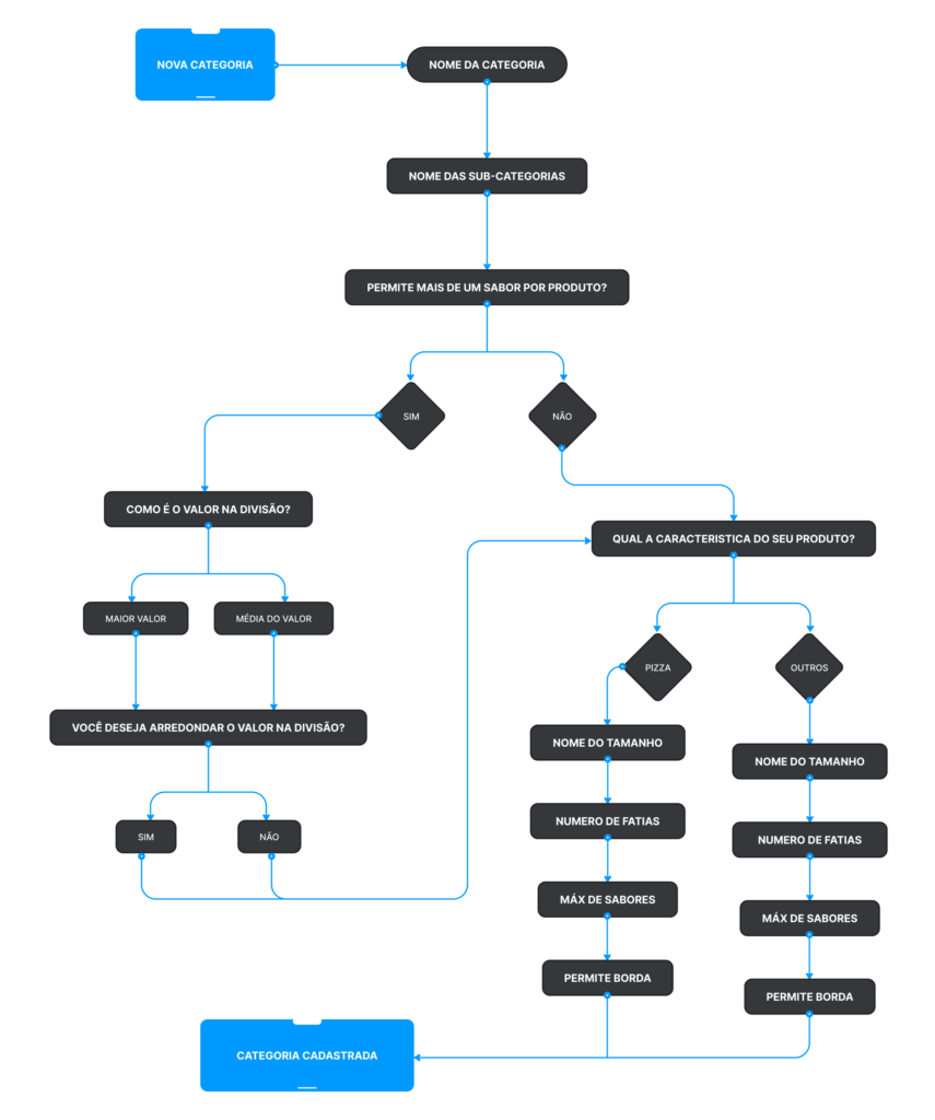
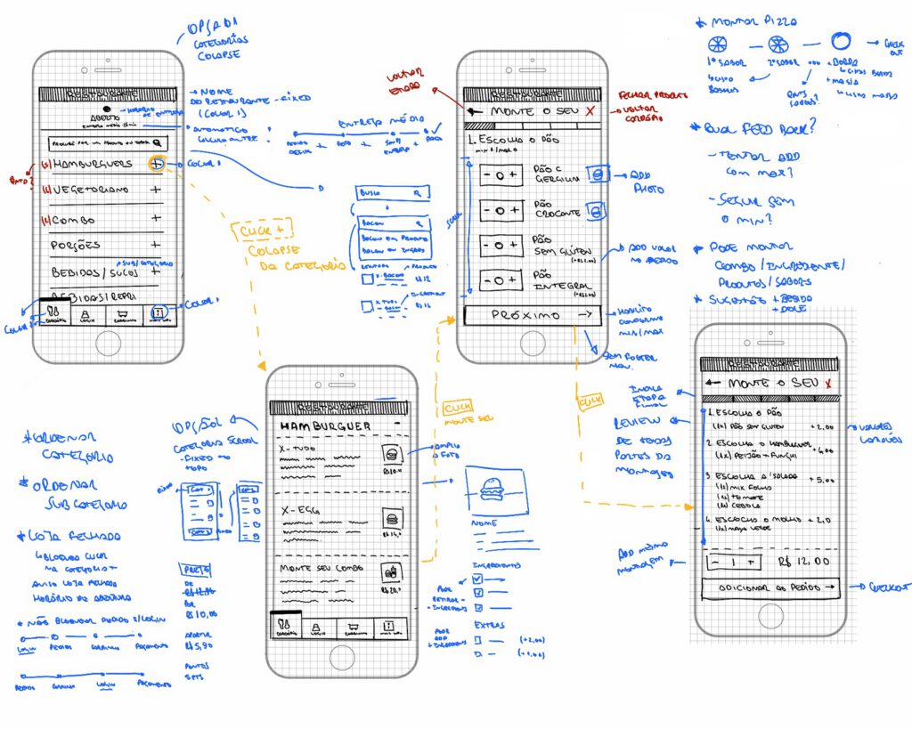
Menu creation was one of the most critical parts of the platform, directly impacting both restaurant operations and the end-user ordering experience. It was closely tied to key metrics such as error reduction and time to complete setup, making usability a central focus.
The process started with deep discovery, combining immersion across different menu types( Italian, Mexican, sushi, pizzerias, and more) with analysis of the existing database, identifying patterns, structures, and recurring behaviors. A comprehensive mind map was then created to map all scenarios and guide the design.
To handle this complexity, the experience was structured as a phased flow, reducing cognitive load and allowing users to focus on one decision at a time. The solution was grounded in principles like progressive disclosure and Hick’s Law, resulting in a clearer and more efficient experience.
Personas
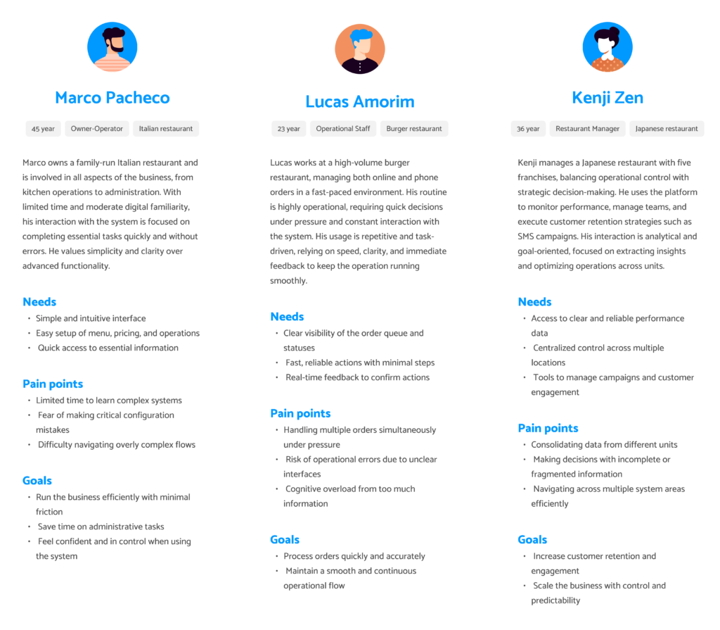
Designing the administrative platform required a deep understanding of a highly diverse user base. The same system needed to support experienced restaurant managers, small business owners handling everything themselves, and operational staff interacting with only specific parts of the platform.
To address this, personas were created based on real usage patterns observed through research, support interactions, and product data. The goal was not only to represent different profiles, but to clarify responsibilities, levels of digital literacy, and context of use within restaurant operations.
This segmentation was essential to guide decisions around information architecture, access levels, and interaction design ensuring the platform remained flexible without compromising clarity. It also helped prioritize features and simplify flows, making the system usable across different realities, from complex operations to small, fast-paced environments.
Card Sorting
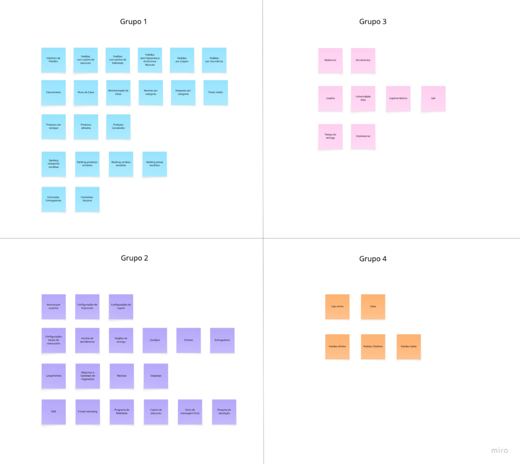
With a wide range of features such as reports, financial tools, marketing, and operational controls the platform had grown in complexity, making navigation and feature discoverability increasingly challenging.To address this, the information architecture was rethought from the ground up. Card sorting was used as a key method to understand how users naturally grouped functionalities and where they expected to find them within the system.
This process helped align the structure of the platform with users’ mental models, reducing friction and improving navigation clarity. As a result, the system became more intuitive, making it easier for different user profiles to locate and use features efficiently, regardless of their level of experience.
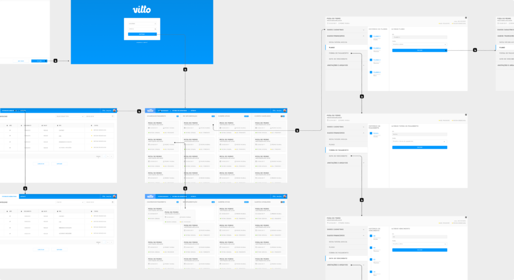
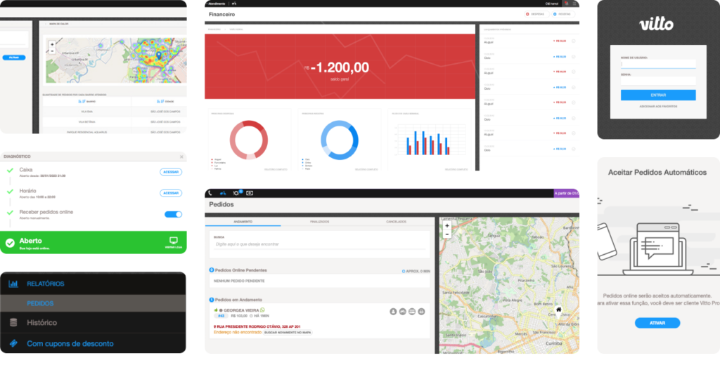
Order Management
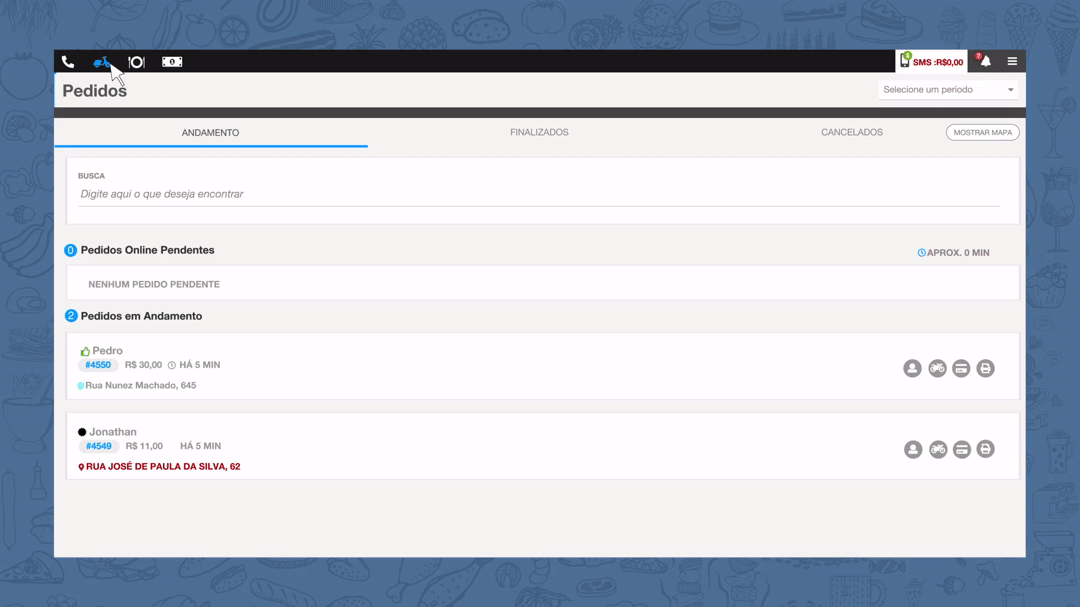
The order management screen was redesigned as a critical operational tool, central to the daily workflow of restaurants. At a time when marketplaces like iFood and Uber Eats were still emerging, restaurants handled the entire operation themselves, making speed and clarity essential.
The challenge was to bring together multiple pieces of information in a single interfaceorder queue, delivery location on the map, assigned delivery person, payment type, printing status, and applied fees, without overwhelming the user.
The solution focused on structuring information hierarchically and making key actions immediately visible, enabling faster decision-making under pressure. The redesign improved operational flow by reducing cognitive load and ensuring that users could quickly understand, prioritize, and act on incoming orders in real time.
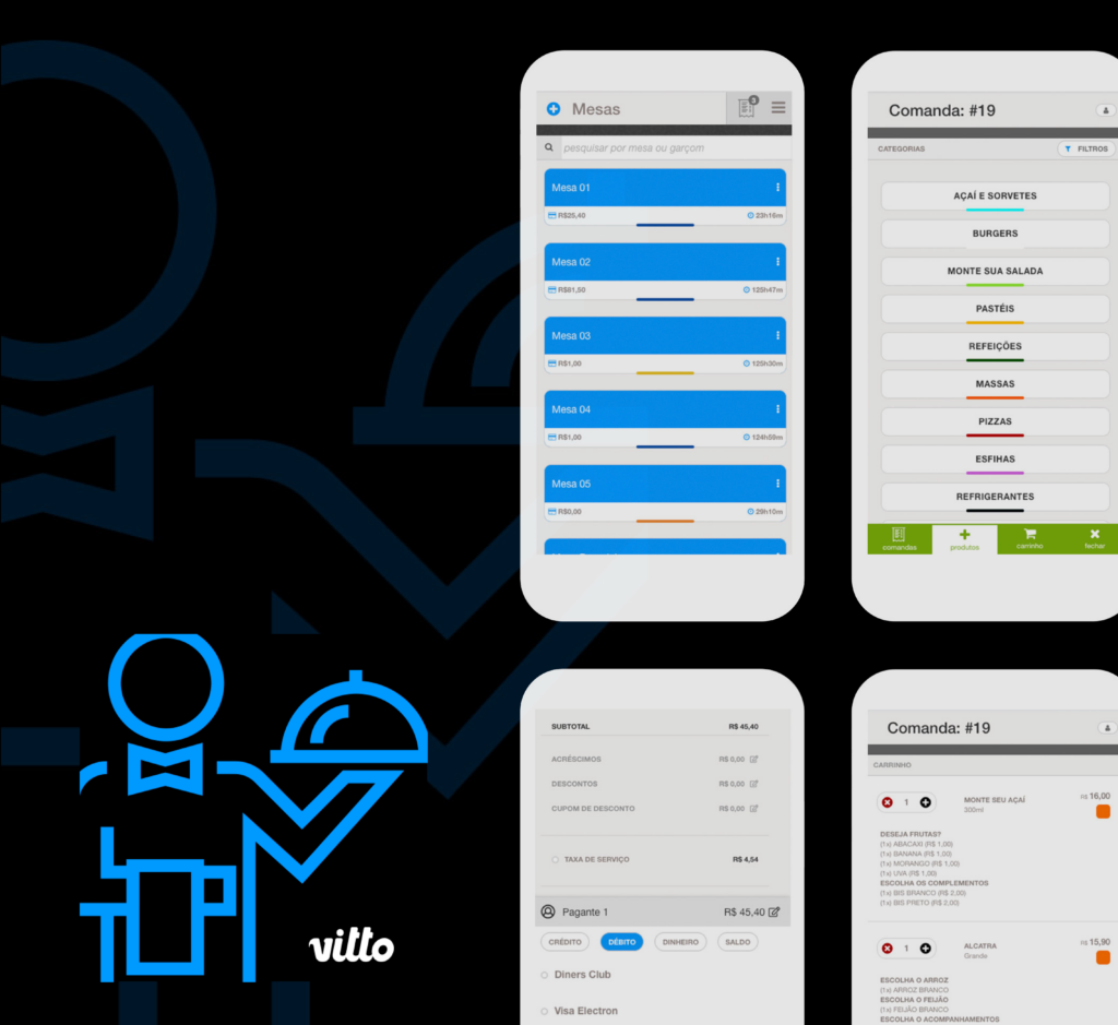
Responsive Experience
The platform was designed with a responsive-first approach, enabling seamless use across desktop, tablets, and mobile devices. As an operational and administrative tool, this flexibility was essential to support the dynamic environment of restaurants, where speed and mobility are critical.
By adapting the interface for smaller screens and touch interactions, the system allowed both managers and staff to perform key tasks more efficiently in different contexts. This approach also enabled a dedicated experience for table service, where waiters could take orders directly from their own devices.
This expanded the platform’s role within the restaurant, supporting operations beyond the back office and improving agility, reducing friction in service, and streamlining communication between front-of-house and kitchen.
#2 App
The consumer app was designed as a white-label solution, allowing each restaurant to create its own branded digital channel with customized visuals, content. At a time when marketplaces were rapidly growing, having a proprietary app gave restaurants more control over their operations, direct access to customer data, and the ability to run their own marketing strategies without relying on third-party platforms or paying high commission fees.
The main challenge was designing a scalable product that could adapt to a wide variety of restaurant models, each with different menus, pricing structures, and ordering logic, while maintaining a consistent and intuitive user experience.
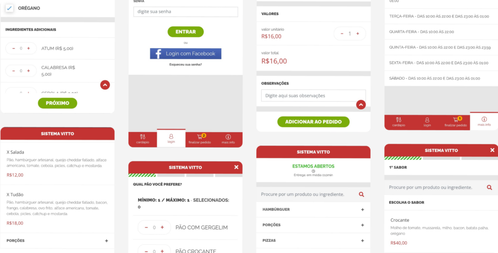
Ordering Flow
The ordering flow was one of the most complex parts of the experience due to the high variability between restaurants. Scenarios such as customizable combos, pizza builders, and dynamic product configurations required flexible interaction patterns without compromising usability.
To address this, usability studies were conducted alongside behavioral analysis using Smartlook, observing how users navigated the flow and where drop-offs occurred. These insights guided continuous refinements, focusing on reducing friction and ensuring users could complete their orders efficiently without abandoning the process before checkout.
Whitelabel
The white-label model was a key differentiator, enabling each restaurant to fully customize the app with its own branding, content, and business logic. This approach strengthened brand identity, reduced dependency on marketplaces, and increased margins by eliminating intermediary fees.
From a UX and product perspective, this introduced significant complexity. The challenge was to create a flexible design system capable of supporting different visual identities and configurations without breaking consistency, usability, or performance across the platform.
From Discovery to Front-end
Working in a lean and highly collaborative team, the process covered the full product lifecycle, from discovery and wireframes to interface design and front-end implementation. I was directly responsible for the front-end development, ensuring pixel-perfect execution and close alignment between design and engineering.
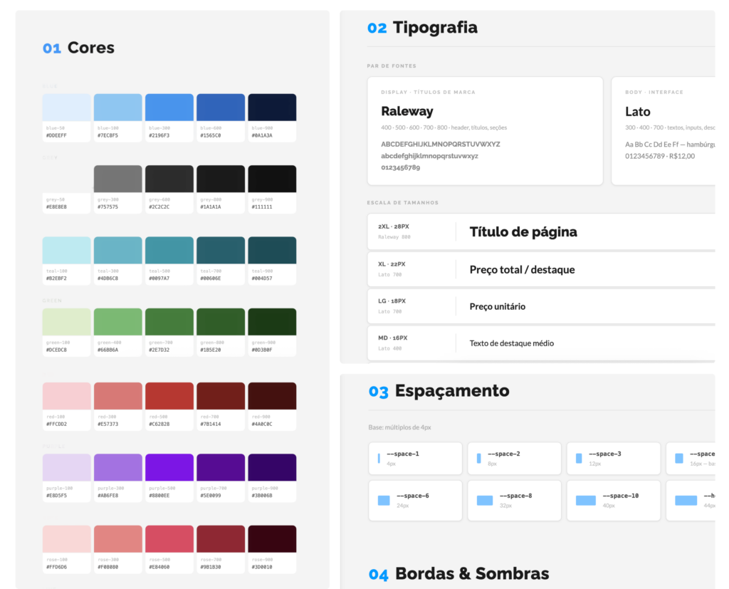
This end-to-end approach enabled faster iterations and more efficient decision-making, reducing gaps between concept and delivery. A structured style guide was also created to support consistency and scalability, allowing the product to evolve while maintaining a coherent experience across different implementations.
# 3 Branding / Marketing
As the product matured and the platform reached a more stable and scalable stage, my role expanded into branding and marketing, focusing on strengthening the company’s positioning and communication.
This phase was centered on creating consistency across all touchpoints, translating the product’s value into clear and compelling narratives. The goal was to align brand, product, and business, ensuring that communication, acquisition, and user experience worked together as a cohesive system.
Instagram Patterns
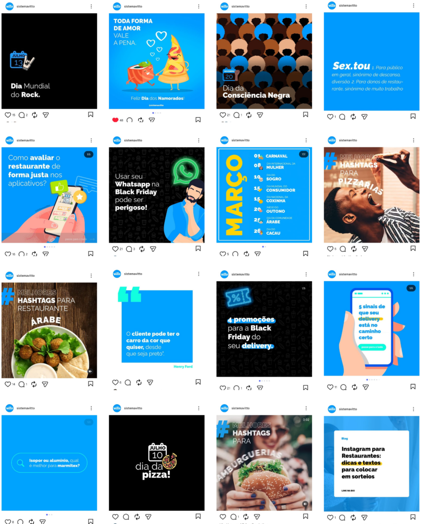
A structured visual and content system was created for Instagram, establishing consistency in tone, layout, and messaging. This included defining visual patterns, typography usage, and content formats aligned with the brand identity.
The goal was to strengthen brand presence, improve recognition, and create a more cohesive communication strategy across posts and campaigns.
Logo Redesign
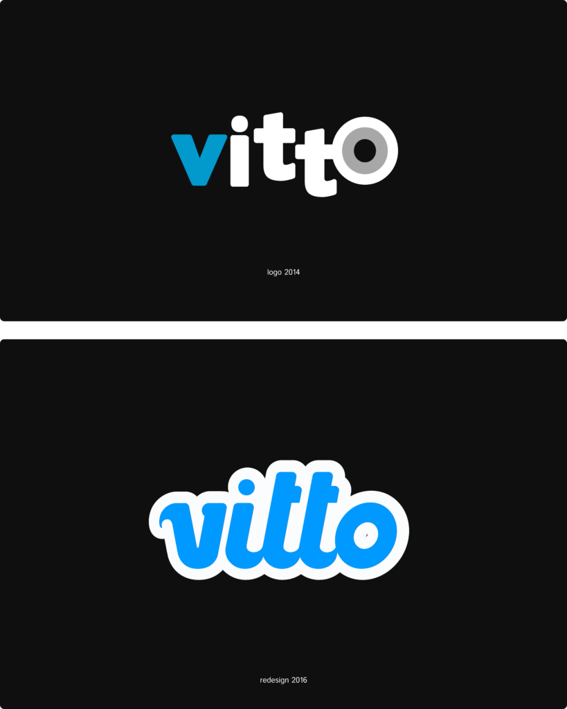
The logo redesign was part of a broader effort to modernize the brand and align it with the product’s evolution. The goal was to create a more contemporary and flexible identity that could scale across digital environments while maintaining recognition.
The process involved refining visual elements, improving readability, and ensuring adaptability across different formats and applications, from product interfaces to marketing materials.
Landing Pages
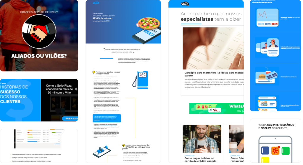
Landing pages played a strategic role in both acquisition and education, especially in a context where many customers were small restaurant owners with limited digital maturity. Beyond promoting the product, these pages needed to demonstrate real business value through successful client cases while also educating users on how to operate and grow their business using the platform.
The challenge was to structure different types of content such as case studies, ebooks, and product narratives into clear and engaging experiences that balanced storytelling and conversion. This required translating business goals into well-defined layouts and interaction patterns, implemented directly in HTML, CSS, and JavaScript to ensure performance, responsiveness, and consistency across all touchpoints.
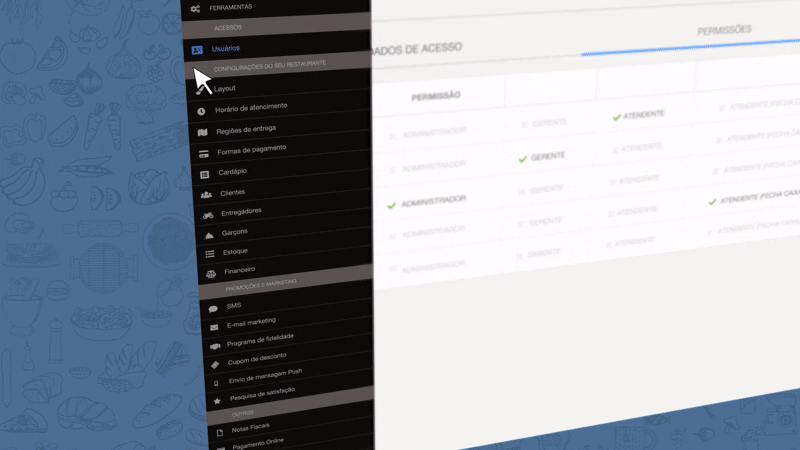
Internal Platform
The internal platform was designed to manage client access to features and handle financial operations, playing a critical role in subscription control and billing processes. Clarity and precision were essential, as any inconsistency could directly impact revenue and internal workflows.
The challenge was to translate complex business rules and permission structures into clear and reliable interactions. The interface and front-end implementation, built with HTML, CSS, and JavaScript, focused on reducing ambiguity, improving visibility of key information, and ensuring that internal teams could manage accounts and financial operations with confidence and accuracy.