Training App
Redesign of a workout app focused on improving clarity, usability, and engagement during training sessions. The project addressed user confusion and high dependency on trainers by simplifying the workout flow, enhancing interaction patterns, and introducing a scalable visual system with dark and light modes.
The Problem
The workout experience was originally designed with the trainer in mind, not the end user actually performing the exercises. As a result, students often felt confused during workouts, lacking clarity on what to do, how to progress, and how each step connected.
This created constant friction in the journey. Students frequently needed support from trainers, increasing dependency and breaking the flow of the training experience. The interface also lacked emotional appeal, making the experience feel rigid and less engaging during an already physically demanding moment.
The Approach
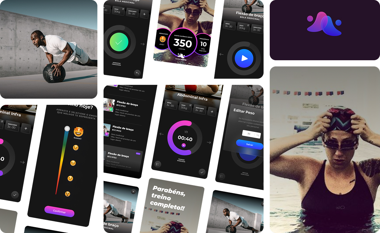
The redesign shifted the focus to the student, prioritizing clarity, guidance, and ease of use during the workout itself. The flow was simplified to make each step more intuitive, with a stronger visual hierarchy and clearer feedback during execution.
Beyond usability improvements, the interface was redesigned to feel more engaging and aligned with the brand, reducing the perceived effort of training. Dark and light modes were introduced, along with a structured style guide to ensure consistency and scalability across the product.
Key interactions such as starting exercises, tracking time, and understanding progress were rethought to minimize confusion and reduce the need for external support.
The Outcome
The new experience made workouts more fluid, intuitive, and enjoyable for students. By reducing confusion, the redesign helped decrease the number of questions directed to trainers, improving the overall efficiency of remote coaching.
At the same time, the introduction of a consistent visual system enabled the team to scale the product more effectively, ensuring coherence across future features and interactions.